How to Choose a Scarf Color Palette for Your Wedding
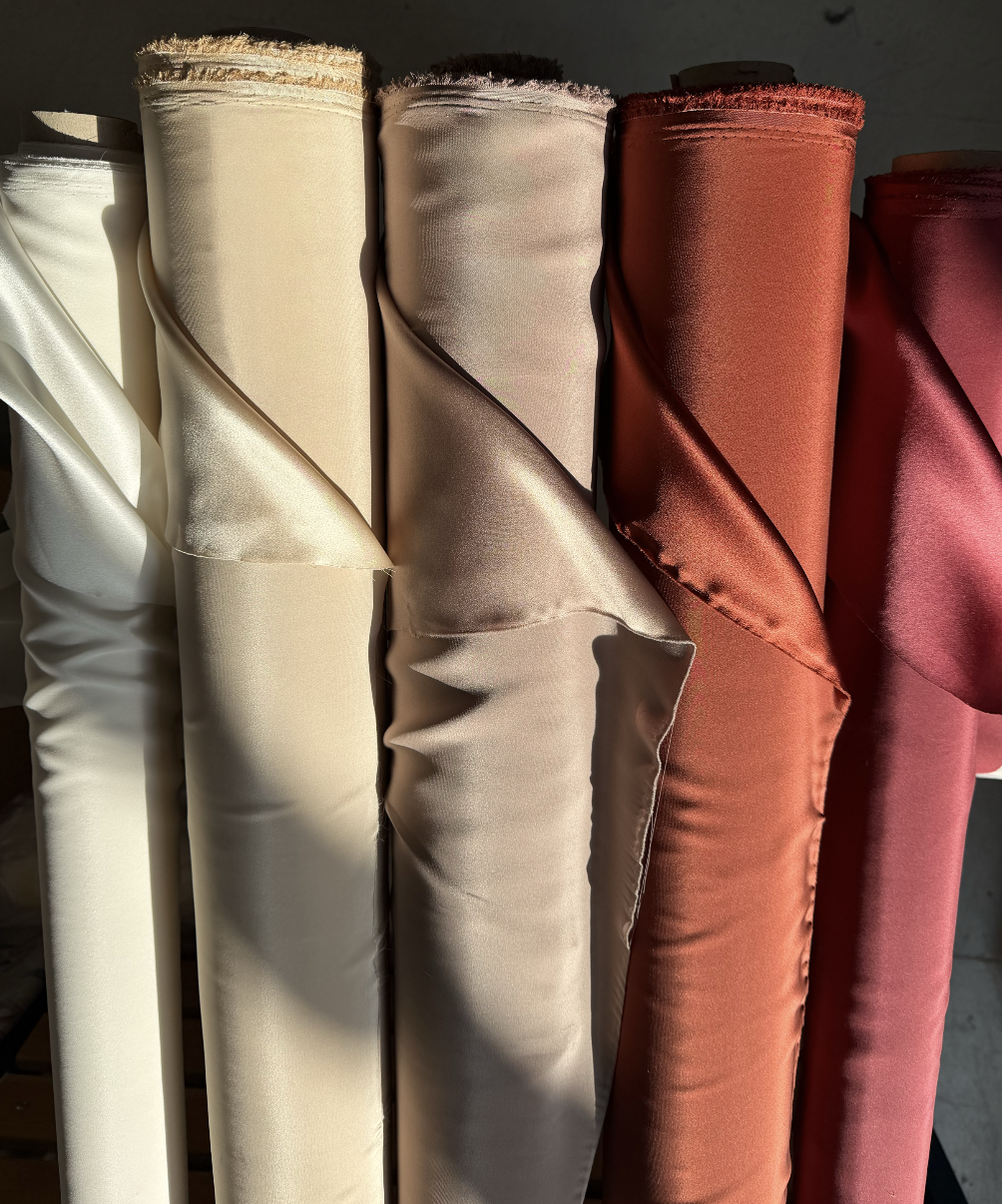
Color on fabric behaves differently than color on a Pinterest board. Here is how to choose a wedding scarf color palette that matches your season, venue and wedding party — and actually looks right once it is printed on silk.
Choosing a color palette for wedding silk scarves and favors feels straightforward until the swatches actually arrive and nothing quite matches the mental picture from months of Pinterest boards. Color on fabric behaves differently from color on a screen, and a wedding color scheme built for florals, linens and stationery does not always translate directly onto silk. This guide covers how to choose a palette that works beautifully as a scarf, not just as an idea.
Start With Your Wedding Palette, Not the Scarf
The scarf color palette should extend from the wedding's existing color story — not compete with it or exist as an isolated decision. Pull the two or three core colors already defined for florals, stationery or the wedding party, and treat those as the foundation. A scarf design built from the same palette as the rest of the day reads as intentional and cohesive in every photograph.
Matching Colors to Season
Spring weddings favor soft, fresh tones — blush, sage, pale lavender and cream — that photograph beautifully in natural daylight and outdoor settings. Summer weddings can support more saturated, vibrant colors — coral, turquoise, sunny yellow — particularly for destination and beach celebrations. Autumn weddings lean naturally toward warm, rich tones — burgundy, burnt orange, deep gold and forest green — that echo the season's own palette. Winter weddings suit deeper, more formal colors — navy, emerald, wine and metallics — that read as elegant under evening and indoor lighting.
Matching Colors to Venue and Setting
A garden or vineyard wedding pairs naturally with botanical greens, soft florals and earthy neutrals that echo the surroundings rather than competing with them. A beach or lakeside destination wedding suits watery blues, sandy neutrals and coral accents that feel native to the setting. A formal ballroom or historic venue supports richer, more saturated colors and metallics that hold their own against grand architecture and evening lighting. A minimalist, modern venue often benefits from a more restrained, two-tone palette that lets the design read as sophisticated rather than busy.
Designing for Groomsmen vs Bridesmaids vs All Guests
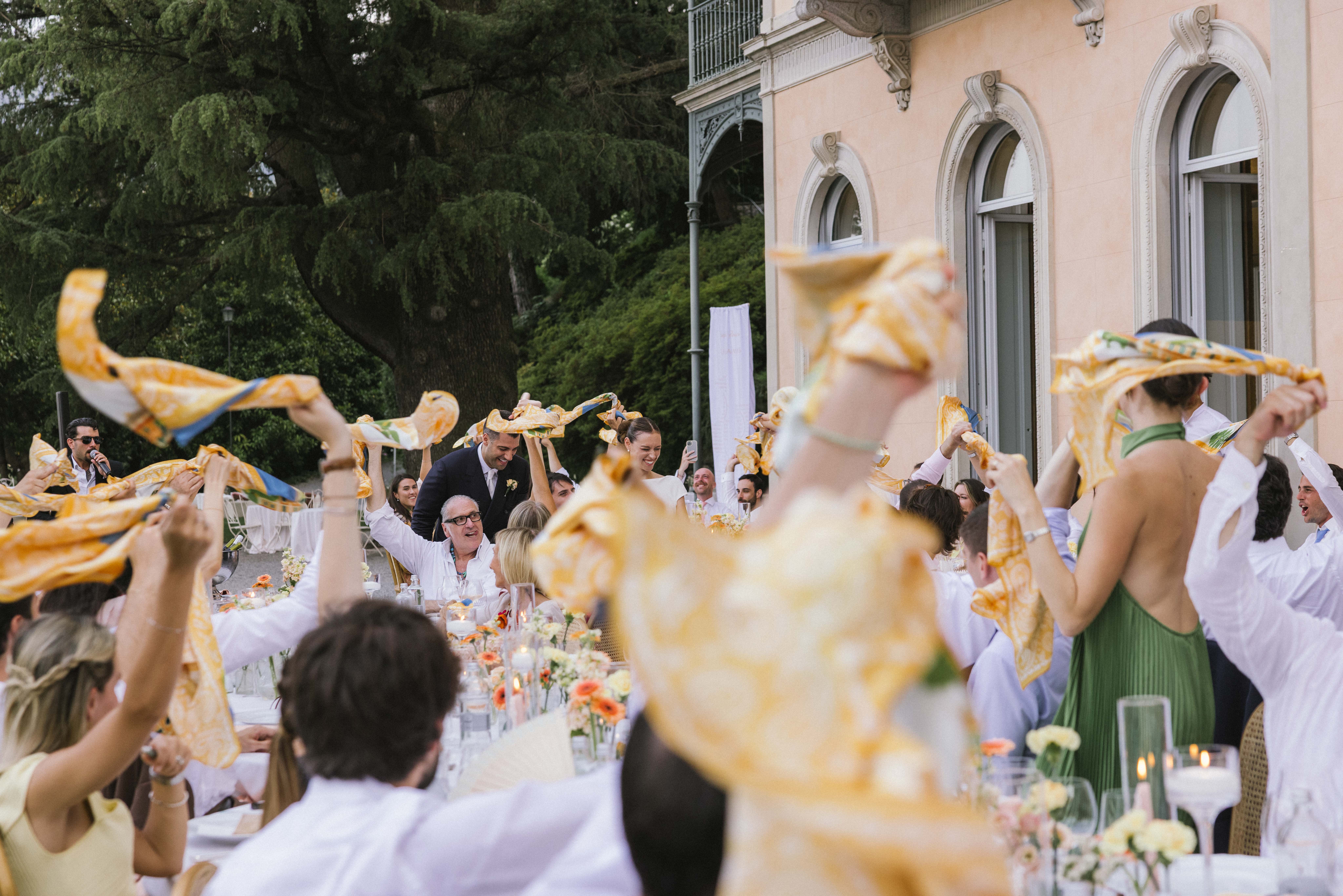
Pocket squares for groomsmen typically work best in a single core color or a subtle pattern drawing from the wedding palette — restrained enough to pair with a range of suit colors. Twillies or scarves for bridesmaids can carry a slightly bolder or more detailed version of the same palette, since they are usually worn as a single coordinated accessory rather than against multiple different outfits. Favors intended for all guests — a broader, more varied audience — generally perform best with a neutral or universally flattering palette that works across a wide range of personal style and skin tones, reserving the boldest colors for the wedding party alone.
Neutral and Timeless Palettes That Always Work
Ivory, champagne and soft gold remain the most consistently successful wedding scarf palette, photographing beautifully across every season and venue type, and wearable by guests long after the wedding itself. Dusty blue and cream offers a similarly safe, elegant option with slightly more visual interest. Sage green and ivory has become a modern classic, particularly for garden and outdoor celebrations.
Bold and Statement Palettes for Modern Weddings
Couples wanting a more distinctive, memorable design increasingly choose bolder combinations — deep emerald with gold, burgundy with blush, or a rich navy with a single vibrant accent color. These palettes work particularly well when the design itself, not just the color, tells a story specific to the couple — a location-inspired illustration, a monogram, or a motif drawn from a shared interest.
Testing Colors Before You Commit
Because fabric renders color differently from a screen or a printed swatch of stationery, any final palette decision should be confirmed on an actual printed silk sample, viewed in the same type of light the wedding itself will take place in — natural daylight for a daytime garden ceremony, warmer artificial light for an evening reception. This single step prevents the majority of color disappointments that arise when a palette is approved from a screen alone.
Seraya Studios produces custom silk scarves, twillies and pocket squares for weddings, entirely made in Como, Italy. Start designing your palette at info@serayastudios.com
Ready to Create Something Extraordinary?
Contact us for a free custom production quote. Made in Como, Italy.
Request a Quote